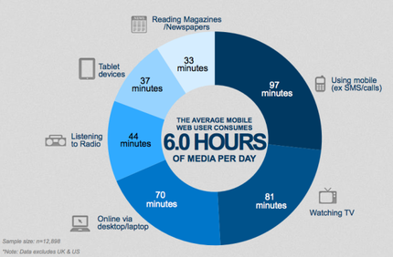
 Image accessed on http://mklnd.com/1kXBUSt Image accessed on http://mklnd.com/1kXBUSt As discussed in previous posts, typically a visitor to your website decides in a matter of seconds if they will choose to continue browsing or leave your site for good. With the number of websites out there, there is no longer an incentive to stay on your website, because with a quick Google search, anyone can find another website selling similar products or with similar information. Here are some quick tips to avoid creating significant flaws in your website, and plan to turn the visitor into a customer! Outdated Information Not surprising this is Number 1. Far too often people do not either 1) update their website regularly which in turn 2) creates a website full of outdated information. It is important that you check back to your website regularly to pick up on anything from spelling errors, to outdated information or simply to offer something fresh, especially for reoccurring visitors. With new product offerings and price changes, these are two ways to force you to go back and take another look at your content. Flash So for some websites flash is necessary, especially if you have online games on your website, and flash definitely offers opportunities for your website in terms of the content you can display. However, flash does have have its pitfalls. It can be extensively slow to load, especially or older computers, or slower internet connections. It can also appear cluttered and messy if you use flash animations, and may not always offer a very professional approach. But then again, if that is your motive, flash is what you need. Poor Navigation Navigation can be everything - make or break in terms of sales and reoccurring visitors. If a visitor struggles to find the next step on your website, chances are, you’ve already lost them. It is important that you can a clear and concise navigation bar (menu). Are you trying to sell something, then include a ‘SHOP’ button on your menu. Other generic important tabs on a menu could be a portfolio to display your projects, contact button for direct communication, potentially a blog or news tab and anything that you need to grab your visitors attention to. Take Apple for example, they have each of their product categories in their menu bar. This offers quick access to each line of products without the need to aimlessly search the entire online store,and helps subtly advertise other products you may want to buy. Accessibility With around 60% of internet access coming from mobile devices (http://mklnd.com/1kXBUSt) it is more important than ever to maximise your content accessibility on a breath of platforms. Whether it be tablet, desktop computer, laptop or mobile, a potential customer can come from anywhere, but mobile is fast taking over. Are you mobile friendly? Many websites still do not offer a mobile friendly alternative to their full experience desktop websites. For some websites this may not be possible, but for many small businesses, it is a must. Mobile websites are fantastic opportunities to provide quick and concise information to people on the go. It is like a tweet - you do not have room to write essays. Sell your point and do it quick! Pop Ups Pop ups simply create an unwanted and cluttered viewing experience. If you use pop ups for advertising, chances are people will hit the red cross and be done with them. Try implementing side banners and incorporate them into your content as the visitor will be seeing the ads (regardless if it is subtly) whilst they read your content. Pop ups are commonly associated with virus and scanning software ads. Especially in a corporate setting (be it small business or product sales), this is not an image you want to portray. They cause severe interrupts to your visitors browsing experience and could potentially put them off browsing your site any further.
2 Comments
I will be starting a series on “EXPLAINED” which provides in-depth insight into a selection of topics to do with your website. Following these, you should be able to build yourself a pretty good website, I’ll say!
The first of my “Explained” series is about keeping your website simple. This is, regardless if website or not, designs should be keep simple. They are used in advertising your brand, and your website is just another form of advertising, but a very important one! People do not like, nor can they handle, over-complicated designs. They get lost and more-often-than-not, you begin to lose them. You begin to lose them in understanding your information and you begin to lose their focus. Both are very important. The saying “more is less” could be very rightly so for design, and something to live by for designer. Of course, as always, there can be exceptions, but generally, it is important to have less, and in most instances, you can provide the same information, and in better format, by keeping it simple! Websites are obviously a foundational place to display your business to the world. Websites are easily accessible and so should the content you have on it! A website should display a few simple things, take note of these:
I will be transparent and say for many companies, you MUST provide more than this (including all legal) but generally for someone starting out or trying to keep it simpler, here is a good starting list of things to include. Website, surprisingly as I once thought, do not need fancy headings, animations (this includes flashing headings, etc) and in fact, these can reck it more often than not. Unless your business is about animations and you sell them, these things can look out of place and detract your audience from reading your important information, and frankly, can leave your website looking tacky. This is what I have discovered over time, and of course, this can be different for every website and person - we are all unique. Remember to keep it simple and tell people exactly what they need to know, and to the point. Don’t blab, don’t tell a story, tell them what they need to know! Think of it like a tweet, there is only limited space to write everything you want, so you NEED to condense it and make it sweet nevertheless. Best of luck. Contact me for any tips or to review and point our benefits to maximise your website: [email protected] Always available for a chat. How is your website looking? Dopey? If it is, you need to pay special attention to the most innovative ways to set up your website user interface based on what is trending this year!
The user interface is what the viewer sees. It's the whole experience they become immersed in when viewing your website. You could replace 'interface' with 'experience' to make it 'user experience' instead of 'user interface' as today the experience as a whole is focussed on more heavily than just the look of the site. Other 'experience' makers or breakers can include: website speed (loading times) and how frequently content is updated and how engaging it is. Is all your website content really that relevant? Ever sat on a website and just got lost in time only to find out later you spent a lot longer on a single site than you thought, like playing your favourite video game? Whether you have experienced that before or not, that's the style of website you need to create! Did you know most customers decide within the first few seconds or so if they want to stay on the website or not, and if they are looking for an item which sells on many places, it is very important to keep them on your site just that little longer. Your website has got to have some wow factor that just tips them over the line and they choose to stay and have a browse. That is what this blog will tell you and we will look at the biggest and best features and design ideas for your website leading into 2014 and a new financial year. Make this year the one! There are so many websites out there that it makes it hard for a consumer to digest all the information as it swarms their faces with millions of listings generated in seconds - in a single search engine search! It is very important that you do not pile mounds of information on your website, especially your home screen (aka landing page). If I saw a website home page with paragraph after paragraph of information I would instantly close that tab. People are so used to receiving information instantly that no one has the time nor wants to make the time to read your entire essay only to find out it's not even what they were searching for. Thus in saying this it is important you keep your home page, especially, free from 'information overload.' that is not to say you may have a page explaining about a product elsewhere on your website, but your home page? This is not a good idea in the slightest. For your home page I strongly recommend a simple graphic to introduce a new product with a sentence or few dot points to provide information. Remember a picture can literally tell a thousand words so make sure you have a graphic that portrays a lot and seriously speaks the product without saying a word. Landing pages are also a great place to collect customer information. Whether this is a good idea for your home page, I would probably avoid it, but on the other hand, this is a good idea if your website is still under construction and you both want to build interest and can potentially market your website opening date to people, and remind them to pop by when it opens, because I'm sure in the millions of other things they did over those last two weeks from entering their name and email on your website to your actual website opening, they have probably forgotten you even exist - so keep them informed!! If you have a website that sells products, make your website home page a sales page or new arrivals to your store, etc. It's far better than a page jam-packed with information or of every product you sell. Showing a page with sales or new arrivals means it's updated frequently so customers have a need to return. An example I can provide is my own company's home page becoming a landing page with a weekly deal. Every week there is a new deal which can range across any of our products or services and they are all random. This is a great way to provide customers something new and every week they can get discounts on services they may need or were looking to buy anyway, but now they can get it cheaper. That sure does conclude my first article on turning your website the right way up! If you have any questions or need further clarification feel free to email [email protected] anytime for a chat.. 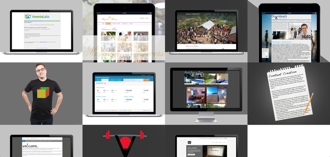 Welcome to the all-new Amax Designs for 2014!! As we said in the previous blog, this year our motto is "Go Bigger and Better, or Go Home!" Since 2010, when we were founded, we have been known to provide innovative and key-catching style. Whether this is regarding our tee design or website development projects. This is our new look website and hosts a wide-angle view of the many pieces that form our portfolio. We have worked with clients based in Europe, America, Asia and of course, in Australia itself. If you are looking for an inspiring development to catch the attention of your loyal followers and help bring new customers by the bundles, then it is important to get your website designed and developed professionally. Customers can be drawn away from your website if it has poor design, as it can make a website appear untrustworthy or a potential scam. If you are in the market for something different, drop us a line today! 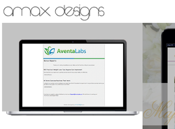 We are working round the clock to get ourselves and our website ready for its 2014 launch. This year our motto is "Go Bigger and Better, or go Home!" Through this motto, we will live our brand, meaning great savings and service for you. If we cannot be better than other web developers, why should be bother trying? But, we can be better!! So during 2014 and beyond, you will experience fantastic savings, great service, advice and we will spend the extra time tweaking your website to make sure it is what you want and what you need! That is not to saying we haven't been doing this prior, it is just this year we really want to prove it. I recommend you drop us a line FIRST and see what we can save you before checking others. If you want, you may send us the quote details of another firm, and we will work hard to beat their price! The picture attached to this blog is a little teaser to what the new website is going to look like. This year we will bringing new ways to pay, including one making a lot of headway. Get ready as this year is starting with a bang. Welcome to the new Amax Designs - redefining website user experiences! I hope you choose to journey with us during 2014. We look forward to seeing you on the other side! We have officially closed "Trendy Traits", pending a new innovation. We found that we can offer a better social experience than what we were providing through Trendy Traits.
Thus, we are looking to re-develop and re-innovate the social networking experience for the world! If we receive enough outcry we will bring back Trendy Traits. However, for now it is...well...gone. We hope you enjoyed the good times Trendy Traits provided whilst it existed. Notably, the games, competitions, opinions, blogs, current news, videos, photos and logins it provided you. We look forward to our next step into providing a 22nd Century experience in the 21st! All the best, Amax Designs Blog!! --Your Very Affordable Solution--
• Website Designer Platform (provides easy-to-use drag/drop interface helper for website development + basic hosting included) • FREE (.com/.net /.org) domain name (must renew this package annually to keep domain) • 15 hours included and 5 hours FREE website support annually (for updates, edits, refinements, coding/designing needs, any support needs) • Ability to expand and purchase additional support hours at low investments • 1 hour of included premium telephone support to get you on your feet or to confirm your visions for the website • Unlimited VIP email support (providing your company a private email address to receive VIP support) Only AU$799 p.a. (limited time offer) WOW! We can't believe that the year has gone so fast. This day, one year ago, on the 14th December, we ventured out into creating our new website and company, AmaxDesigns.com. From the roots of nothing to our ongoing success one year later, we are growing into a success story that we thank you for being a part of. With our ongoing success and many years to come, we want to let you know that we have some fantastic new products and services being released. This year was a lot about developing everything as we slowly but surely release fantastic products over the next ever-successful years. With another year comes more goals, they are:
- New products and services; - Innovative Global Support; - much, much more. You'll have to stay posted to discover more! Merry Christmas and a Happy New Year to every one of you. Best wishes for safety over the Christmas break. May you enjoy time to relax and time with family. Hopefully, you are all spoiled by Santa and family alike. Thank you especially to all those who have supported Amax Designs during the year. We look forward to your fantastic support again next year. Whether you have visited once, twice or hundreds of times before - or even if this is your very fist time here, we would like to thank you personally.
Amax Designs will be developing an all new line of products and online services throughout 2012 and all will be released first quarter 2013 and that is final. All will be released. We will revolutionize the technology industry. You have been warned....be prepared! Just a quick news update to let you know we have new stock available for purchase. This stock is fresh, early, and made for 2012 (so we have it exclusively early). We have tees, caps and lots, lots more. So DON'T delay - purchase online today and receive shipments fast and are securely. All products come with a 30-day satisfaction guarantee. If you are unhappy, simple return and receieve a full refund ASAP.
Remember we also have a giveaway happening. If you are one of the every 10th buyers or 1000th buyer you will receive: 10th - FREE second item of one the one's you purchased; 1000th - FREE iPad Hope to see you wearing our tees soon! Ciao for now - not forever. |
Amax Designs
Redefining the user experience on your website. We are not just bringing it to 21st Century standards but taking it beyond that, to the 22nd Century. Categories
All
Archives
March 2015
|



 RSS Feed
