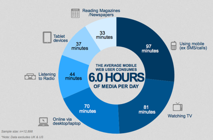
 Image accessed on http://mklnd.com/1kXBUSt Image accessed on http://mklnd.com/1kXBUSt As discussed in previous posts, typically a visitor to your website decides in a matter of seconds if they will choose to continue browsing or leave your site for good. With the number of websites out there, there is no longer an incentive to stay on your website, because with a quick Google search, anyone can find another website selling similar products or with similar information. Here are some quick tips to avoid creating significant flaws in your website, and plan to turn the visitor into a customer! Outdated Information Not surprising this is Number 1. Far too often people do not either 1) update their website regularly which in turn 2) creates a website full of outdated information. It is important that you check back to your website regularly to pick up on anything from spelling errors, to outdated information or simply to offer something fresh, especially for reoccurring visitors. With new product offerings and price changes, these are two ways to force you to go back and take another look at your content. Flash So for some websites flash is necessary, especially if you have online games on your website, and flash definitely offers opportunities for your website in terms of the content you can display. However, flash does have have its pitfalls. It can be extensively slow to load, especially or older computers, or slower internet connections. It can also appear cluttered and messy if you use flash animations, and may not always offer a very professional approach. But then again, if that is your motive, flash is what you need. Poor Navigation Navigation can be everything - make or break in terms of sales and reoccurring visitors. If a visitor struggles to find the next step on your website, chances are, you’ve already lost them. It is important that you can a clear and concise navigation bar (menu). Are you trying to sell something, then include a ‘SHOP’ button on your menu. Other generic important tabs on a menu could be a portfolio to display your projects, contact button for direct communication, potentially a blog or news tab and anything that you need to grab your visitors attention to. Take Apple for example, they have each of their product categories in their menu bar. This offers quick access to each line of products without the need to aimlessly search the entire online store,and helps subtly advertise other products you may want to buy. Accessibility With around 60% of internet access coming from mobile devices (http://mklnd.com/1kXBUSt) it is more important than ever to maximise your content accessibility on a breath of platforms. Whether it be tablet, desktop computer, laptop or mobile, a potential customer can come from anywhere, but mobile is fast taking over. Are you mobile friendly? Many websites still do not offer a mobile friendly alternative to their full experience desktop websites. For some websites this may not be possible, but for many small businesses, it is a must. Mobile websites are fantastic opportunities to provide quick and concise information to people on the go. It is like a tweet - you do not have room to write essays. Sell your point and do it quick! Pop Ups Pop ups simply create an unwanted and cluttered viewing experience. If you use pop ups for advertising, chances are people will hit the red cross and be done with them. Try implementing side banners and incorporate them into your content as the visitor will be seeing the ads (regardless if it is subtly) whilst they read your content. Pop ups are commonly associated with virus and scanning software ads. Especially in a corporate setting (be it small business or product sales), this is not an image you want to portray. They cause severe interrupts to your visitors browsing experience and could potentially put them off browsing your site any further.
2 Comments
|
Amax Designs
Redefining the user experience on your website. We are not just bringing it to 21st Century standards but taking it beyond that, to the 22nd Century. Categories
All
Archives
March 2015
|


 RSS Feed
